Editing Elements

Editing Text
- Double click any text box or button to start editing its contents.
- Double click an input field to edit the placeholder text.
- You can use Control + B to bold text and Control + I to italicize once highlighted in the builder.
Changing Font Color
- First select the text box, button or input field you'd like to change the font color for.
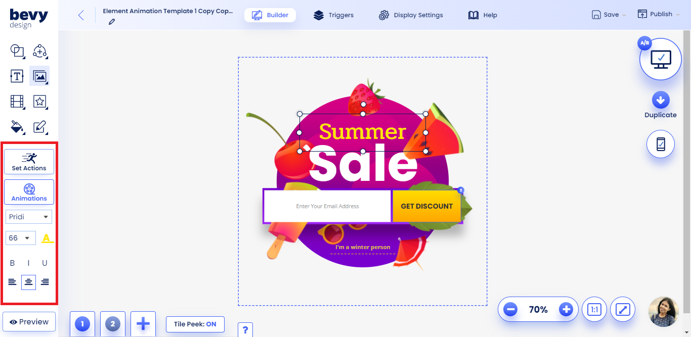
- Click the A with an underline that appears on the left toolbar.
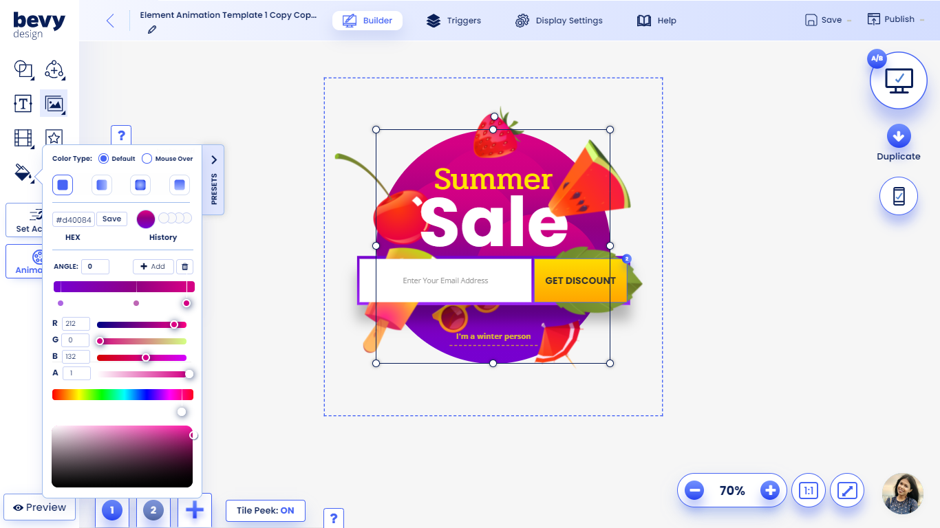
- Select a solid color from the color grid, enter a hexadecimal or use the color slider to make a selection.
- Exit the color picker by clicking outside of it.
Changing Font Size
-
First select the text box, button or input fields you'd like to change the size for.
-
Click the font size dropdown to choose a new font size or type your desired size
NOTE: For mobile input fields, set a minimum size of 16 pixels to avoid erratic behavior.
Other Font Options
- You can align text in the left, center or right of the selected element.
- Use the Bold, Underline and Italic controls to further modify the text.

Editing Background Color
-
To edit the background color of any element, click the Paint Bucket and select a color to start editing.
NOTE: The foreground color of icons will change color when the paint bucket is used.
Using the Color Grid
- One of the options you have is to select a color from the grid to set a new background.
- The first tile is full transparency
- The other tiles in the first two rows are gradient colors.
Setting Custom Color (Hexadecimal)
- Enter a hex color code in the designated space.
- Click enter to confirm the color.
- Here is a guide on hexadecimal coloring.
Adjusting Opacity (Transparency)
- The first tile in the color pallet is transparency.
- Adjust the 'A' slider to modify the opacity of any color.
Saving brand colors to your account
- First select a color or gradient you'd like to save.
- Click the plus button in the color menu to save it to your account.
Advanced Gradient Guide
- To start building a gradient, click the Solid Color dropdown to select a gradient type.
- Click the Add button to add another color to the gradient.
- You can click on the color squares to modify each of the seperate properties.
- Select a color from the grid or use the sliders to modify each part of the gradient.
- You can drag the squares to the left and right in order to modify the gradient pattern.
- Click the x button once a gradient square is selected to remove it.
Setting an On-Hover Color
- Click the default color dropdown to select an on-hover color.
- While having the on-hover color selected in the dropdown, you will preview the new color.

Editing Borders or Outlines
- Click on any element to set a border or outline.
- Then select the Borders menu to initiate the outline creation process.
Setting Border Style
- There are several types of borders you can create with Bevy Design. Click the dropdown in the borders menu to change the style. Some styles can be seen below:
- Solid Line
- Dashed Line
- Dotted Line
- Double Line
Choosing Border Color
- Click on the color tile in the borders menu.
- Select a non-gradient color to set it as your border color.
Setting Border Width
- Enter the size of pixels into the input boxes to change the border size.
- Enter a pixel value in the left-most input field to set a border on every side.
- If you'd like to set specific sizes you can use the other 4 input fields. They represent the following | Top Border | Left Border | Bottom Border | Right Border |
Rounding the Border
- In the Border Roundness input field enter a value from 1-88 px.
- Higher values result in rounder edges.

Adding Shadows
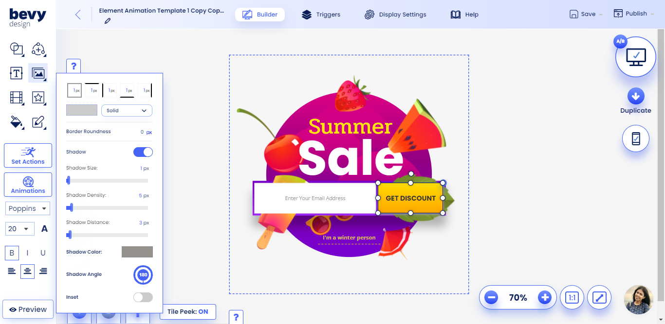
- You can add a shadow to any element on Bevy Design using the Shadows option in the borders menu.
- Start off by toggling the Shadow button.
Changing Shadow Color
- Click the color tile to select a shadow color.
- You can only use solid colors as shadows.
Advanced Shadow Techniques
Using these techniques will help you add depth to each individual element.
Shadow Size
- Increase this slider to create a larger shadow around the element you've chosen.
Shadow Density
- Increasing the pixel value for density makes the shadow less dense/dark.
Shadow Distance
- Increasing shadow distance moves the shadow in the direction of the angle you've set.
Shadow Color
- Click the color tile select a shadow color.
- Note: you can only select a solid color as a gradient.
Shadow Angle
- Click and drag the angle dial to change the angle of the shadow's distance.
- You can also modify the angle by editing the angle text.